Tayonna Thomas Portfolio
✦Selection and Filters✦


A color splash image is an image with a monochrome background but has an objects that is in color. Color splashing an image is an interesting way to may an object stand out.
For our color splash assignment we were asked to create a color splashed image by selecting an object in an image of our choice using the of selection tools we recently learned of.
Color Splash


Original Image
Color Splash
I found this as a fun assignment. I enjoyed how simple yet pleasing it was to see the end result. I had most difficulty with the tiger image because the green color from the background would fade into the fur which was not the easiest to correct. My solution was to select by color range and desaturate the image that way. Other times I'd select the area and tone down the saturation slightly until the green was for the most part not visible. The selection tool I used most was the quick selection tool. It's definitely a great tool to use, it's very smart and can differ and object from another as long as the color isn't too similar. However sometimes it is not completely accurate and you must go back and refine your selection. I found that the lasso tool was very useful when it came to that.


Filtered Images
A filter splash is similar to a color splash however instead of desaturating the background you place a filter on it. A filter usually looks like a different art style or texture. They seem pretty interesting to look at however I think I was more pleased with the color splash images.
Click 'Show more' to view more images

Refine Edge Tool
The refine edge tool can be accessed by selecting an object with the quick selection tool. Its purpose is to selecting detailed and individual things such as hair accurately. I was amazed at how well it did it's job and am still figuring out how the tool can detect all details. I though it was super cool and handy to use.

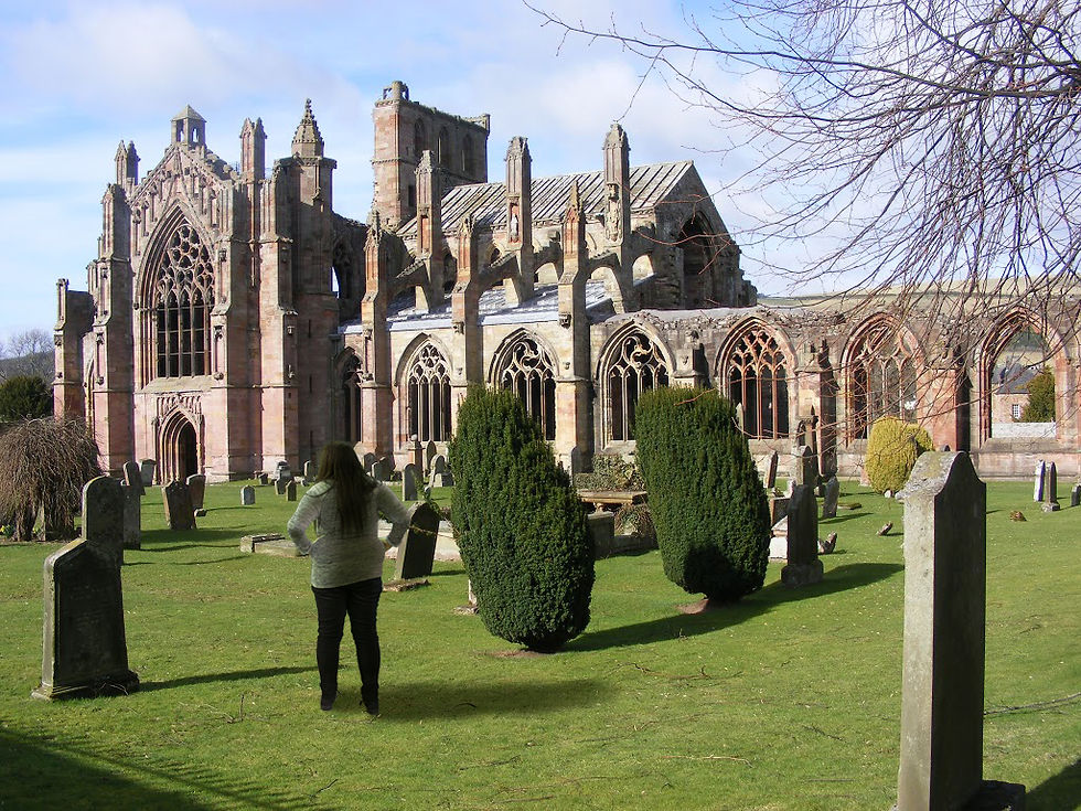


Adding Self image into other Images
For this assignment we were asked to take a picture of ourselves and add it to another image. Then, we were to edit ourselves so we appear to fit in with the scene and atmosphere. I chose Rosslyn Chapel because in the image of it I liked the lighting intensity. However I found that it wasn’t as easy as I first thought. The intense shadows made it difficult to determine the shading on my back. For the shading I used my previous knowledge from Paint Tool Sai and added a clipping mask and used the layer modes to find the correct look. I also added a small warm filter and used color replace a few times.
Then we were asked to do the same thing but with a scene from a movie. I haven’t seen very many movies so choosing wasn’t the easiest. I end up choosing The Hunger Games. For that image, I did the same technique of shading and used the clipping masks and layer modes to find the correct shading. I also played with the exposure and levels a bit. Then later, I noticed that the quality of the image wasn’t as good as the image of me. So I added a small bit of noise and a blur to myself to make me fit better in the image. I am more proud of that image than the first one because it looks like I fit in better.